skip to main |
skip to sidebar
Children in Buffalo
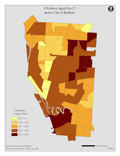
 The above map is the original figure used to illustrate the distribution of children aged 5 to 17 in the City of Buffalo. Like the ethnicity map, I revised the title; so I could cut down on the number of words and also use census tract in the legend and changed the scale to miles. I found the original color scheme a little hard to distinguish. The below map uses more distinct color values to demarcate the percentage divisions. I also added a background color, because of the clipped geographic area.
 The above map is the original figure used to illustrate the distribution of children aged 5 to 17 in the City of Buffalo. Like the ethnicity map, I revised the title; so I could cut down on the number of words and also use census tract in the legend and changed the scale to miles. I found the original color scheme a little hard to distinguish. The below map uses more distinct color values to demarcate the percentage divisions. I also added a background color, because of the clipped geographic area.
No comments:
Post a Comment