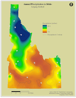
The Annual Precipitation in Idaho map illustrates the range of precipitation values throughout the state. The precipitation values are higher in the northern portion of the state and become lower as you head to the southeast. The shapefile used to create the precipitation surface was a point file of weather stations throughout Idaho with an attribute of annual precipitation. The above map surface was created using the Kriging method of interpolation – using a lag size of 40,000 and 12 as the number of lags. The below map was created through interpolation using the inverse distance weighting method.
In comparing the two maps, I kept the format the same. My only change to the map was using a different background color in the Kriging map than in the IDW map. As far as the methods used in the interpolation, both capture the overall trend in the data – that is, in Idaho precipitation drops from the northwest to the southeast of the state. Visually, the Kriging method is a little smoother. A little of the detail is lost compared to the IDW method, but the overall trend is still evident. In the IDW method, there are too many small circles that do not necessarily need to be shown when dealing with a statewide dataset.


 This map represents the population of Native Americans in Idaho by County. The design of the map attempts to balance the page so one portion is not too weighted with information. I chose a UTM projection to avoid the stretched look in the example. I also chose a background color to make the outline of Idaho “pop” more. The only design issue I had with the variable I chose was the clustering of the dots that probably coincide with the Reservations in Idaho. In order to assure that some counties had two or three dots, I had to choose a relatively low value for the dot (1 person equals five persons).
 This map depicts the total population of the world capital cities with a population greater than 750,000 centered on Western Europe. The design of the map seems to reflect my penchant for organizing a map – north arrow in the upper right corner, the legend in the lower left corner, etc. The color choices were fairly straightforward. I chose a light blue for the oceans, and a light brown for the land areas. I wanted the symbols to visible over the land areas. The symbol color, I feel, is not too bright or too dark and fits with the other color choices. The design issue that was the most time consuming was designing the legend.