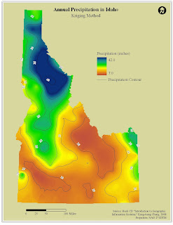
The Annual Precipitation in Idaho map illustrates the range of precipitation values throughout the state. The precipitation values are higher in the northern portion of the state and become lower as you head to the southeast. The shapefile used to create the precipitation surface was a point file of weather stations throughout Idaho with an attribute of annual precipitation. The above map surface was created using the Kriging method of interpolation – using a lag size of 40,000 and 12 as the number of lags. The below map was created through interpolation using the inverse distance weighting method.
In comparing the two maps, I kept the format the same. My only change to the map was using a different background color in the Kriging map than in the IDW map. As far as the methods used in the interpolation, both capture the overall trend in the data – that is, in Idaho precipitation drops from the northwest to the southeast of the state. Visually, the Kriging method is a little smoother. A little of the detail is lost compared to the IDW method, but the overall trend is still evident. In the IDW method, there are too many small circles that do not necessarily need to be shown when dealing with a statewide dataset.

No comments:
Post a Comment