Wednesday, April 22, 2009
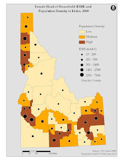
Population Density and Female Head of Household
The Female Head of Household and Population Density in Idaho map was constructed using US Census Bureau information from the year 2000. The census data is contained within a shapefile of Idaho counties. This map displays two variables using color hues for population density and a graduated circle to represent the total number of female head of households by county. The bivariate map allows the viewer to look see two variables represented simultaneously. Looking at the population density colors, one notices a high population density in the north as well as belt of high population density in the south. It also appears that the number of female headed households is correlated with higher population densities. The bivariate map is an easy way to look at two variables and how they coincide in space. I think the only limitation is in designing a clear legend.
Map of the Week
This map was scanned from a recent National Geographic. I think it is an interesting map, in that it both informs the viewer about a geographic phenomena and it is also displays it in an unique way. The map defines states, cities, and other features by their indigenous definition. It might be a little hard to see, and I apologize for the scanning. I tried to keep as much of the US as I could. Let me know if you would like to see an area blown up.
Minority Population
The Minority Population in Idaho map was constructed using US Census Bureau information from the year 2000. The census data is contained within a shapefile of Idaho counties. Since the minority population is composed of multiple ethnicities, the pie chart is an ideal method to display the variability in the data. Two trends become apparent using the pie chart mapping. The first is that the dominant ethnicity in Idaho is Hispanic. The next is that the southern part of the state has a greater total minority than the northern panhandle. The other category in the pie chart raises some interesting questions. The obvious is: what dos other mean in regards to ethnicity? The other one is: why does Idaho have a significant population of this other category? The main limitation to the pie chart method is that it is a little confusing. It is a bit of a challenge to match up the pies with the counties they are meant to represent. However, it is a nice way to look at a variety of related attributes to discern some patterns.
Friday, April 17, 2009
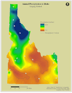
Annual Precipitation in Idaho - Two methods in visualization
The Annual Precipitation in Idaho map illustrates the range of precipitation values throughout the state. The precipitation values are higher in the northern portion of the state and become lower as you head to the southeast. The shapefile used to create the precipitation surface was a point file of weather stations throughout Idaho with an attribute of annual precipitation. The above map surface was created using the Kriging method of interpolation – using a lag size of 40,000 and 12 as the number of lags. The below map was created through interpolation using the inverse distance weighting method.
In comparing the two maps, I kept the format the same. My only change to the map was using a different background color in the Kriging map than in the IDW map. As far as the methods used in the interpolation, both capture the overall trend in the data – that is, in Idaho precipitation drops from the northwest to the southeast of the state. Visually, the Kriging method is a little smoother. A little of the detail is lost compared to the IDW method, but the overall trend is still evident. In the IDW method, there are too many small circles that do not necessarily need to be shown when dealing with a statewide dataset.
Wednesday, April 8, 2009
Native American Population in Idaho
This map represents the population of Native Americans in Idaho by County. The design of the map attempts to balance the page so one portion is not too weighted with information. I chose a UTM projection to avoid the stretched look in the example. I also chose a background color to make the outline of Idaho “pop” more. The only design issue I had with the variable I chose was the clustering of the dots that probably coincide with the Reservations in Idaho. In order to assure that some counties had two or three dots, I had to choose a relatively low value for the dot (1 person equals five persons).
World Capital Population
This map depicts the total population of the world capital cities with a population greater than 750,000 centered on Western Europe. The design of the map seems to reflect my penchant for organizing a map – north arrow in the upper right corner, the legend in the lower left corner, etc. The color choices were fairly straightforward. I chose a light blue for the oceans, and a light brown for the land areas. I wanted the symbols to visible over the land areas. The symbol color, I feel, is not too bright or too dark and fits with the other color choices. The design issue that was the most time consuming was designing the legend.
Multiple Ethnicity in Buffalo
This map illustrates the distribution of people who have multiple ethnicity in the City of Buffalo by census tract. I chose a light gray color for the background and a light yellow for the census tracts. The symbol choice reflects my desire not to use a circle and to avoid a square. It is evident from the symbol sizes where there is a cluster of multiple ethnic peoples. With my experience from the previous map the arrangement of the legend was a little easier. The most challenging part of the exercise was the back and forth of size values. It would be interesting to compare this map with the map from lab 1.
Wednesday, April 1, 2009
Boulder County - Freehand Exercise
The Lab 2 exercise centered on familiarizing us with the program Macromedia Freehand. We were given the above "map," and were asked to add certain features according to the exercise directions. The two maps show Boulder County, Colorado. The included features are cities, roads, rivers/creeks, plus two park areas. The above map is me basically following the directions, and trying to finish the lab. I was having a hard time being engaged by the exercise, because we were not working with "real" gis data. The same holds true for my revisions. I did not go out of my way to enhance the map. I did a few more road labels and the added background color, which definitely helps with the display.
Subscribe to:
Posts (Atom)