

 This map represents the population of Native Americans in Idaho by County. The design of the map attempts to balance the page so one portion is not too weighted with information. I chose a UTM projection to avoid the stretched look in the example. I also chose a background color to make the outline of Idaho “pop” more. The only design issue I had with the variable I chose was the clustering of the dots that probably coincide with the Reservations in Idaho. In order to assure that some counties had two or three dots, I had to choose a relatively low value for the dot (1 person equals five persons).
 This map depicts the total population of the world capital cities with a population greater than 750,000 centered on Western Europe. The design of the map seems to reflect my penchant for organizing a map – north arrow in the upper right corner, the legend in the lower left corner, etc. The color choices were fairly straightforward. I chose a light blue for the oceans, and a light brown for the land areas. I wanted the symbols to visible over the land areas. The symbol color, I feel, is not too bright or too dark and fits with the other color choices. The design issue that was the most time consuming was designing the legend.

This map illustrates the distribution of people who have multiple ethnicity in the City of Buffalo by census tract. I chose a light gray color for the background and a light yellow for the census tracts. The symbol choice reflects my desire not to use a circle and to avoid a square. It is evident from the symbol sizes where there is a cluster of multiple ethnic peoples. With my experience from the previous map the arrangement of the legend was a little easier. The most challenging part of the exercise was the back and forth of size values. It would be interesting to compare this map with the map from lab 1.
 The Lab 2 exercise centered on familiarizing us with the program Macromedia Freehand. We were given the above "map," and were asked to add certain features according to the exercise directions. The two maps show Boulder County, Colorado. The included features are cities, roads, rivers/creeks, plus two park areas. The above map is me basically following the directions, and trying to finish the lab. I was having a hard time being engaged by the exercise, because we were not working with "real" gis data. The same holds true for my revisions. I did not go out of my way to enhance the map. I did a few more road labels and the added background color, which definitely helps with the display.
 For this exercise, we were asked to peruse the census website and download a text file as well as the associated shapefile. I spent to much time trying to find some interesting data, instead of working on the assignment. I chose median age for two reasons: 1) the data was already normalized and 2) living in Pullman I was interested in the median age of the county. I assumed that it would be young based on the university, but then to see how that plays out over the whole state intrigued me. The layout of the map reflects the instructions provided. Again, the above map is the original and the below map is the revised. I added a title to the legend to relect that the data is by county. I also increased the font size of the scale bar and the source information for better visibility. I changed the north arrow. I thought the original was hard to see, and I moved it to the upper right corner. I think I have been making too many maps/figures on 8.5 X 11 paper. To me the north arrow belongs in the upper right corner.
 This map was an exercise in generalization and how it effects visualizing a given feature. The feature used was a section of rivers in Idaho, Washington, and Oregon. The assignment was to generalize the rivers shapefile using significant tolerance values of 500 and 2,000 meters, and then make a map to illustrate the differences. The above map is the original, while the below map is the revised map. I have a problem with the title. I think it is too long, but it does describe the map. So, I made it two lines instead of three, but left the text alone. I changed the scale units to miles, again. Reorganized the legend; so, the original file is on top. I also deleted the word legend and moved the legend to the center bottom of the map. I added a source line. I just used the class as a data source, and moved it to the bottom right corner along with the scale bar. The most significant edit I made was adding the state lines for perspective.
 The Nez Perce map shows how the aboriginal land has been reduced over time through western expansion and treaty negotiations. For the revisions I made, they were mostly small edits. As with the other maps, I changed the scale to miles. I also removed the word legend from the legend. I moved the legend over the scale bar and increased the font size of the items. I made the title be one line. For the inset map, I added the word "inset" and changed the reservation to an outline like it is in the detail map.
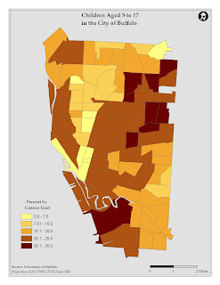
 The above map is the original figure used to illustrate the distribution of children aged 5 to 17 in the City of Buffalo. Like the ethnicity map, I revised the title; so I could cut down on the number of words and also use census tract in the legend and changed the scale to miles. I found the original color scheme a little hard to distinguish. The below map uses more distinct color values to demarcate the percentage divisions. I also added a background color, because of the clipped geographic area.

The above map illustrates the distribution of the predominant ethnicity by census tract within the City of Buffalo. I am content with the map, overall. It is, in my mind, well-balanced. I did find some areas of improvement starting with the title. Even in the original I avoided using the word race (I am an anthropologist, so technically, there are no "races."), but using the word dominant in describing ethnicity sound a little creepy. The correct word is predominant. I also removed by census tract from the title to shorten it. In the legend I gave it a title to mention that the geographical units are census tracts. Also, I changed the scale bar units to miles; we are in the United States. Finally, since the map is representing a clipped area, I added a background color. The below map is my revised one.
